






 简体中文
简体中文 Español
 Français
 Deutsch
 Русский
 Português
 Italiano
 日本语
日本语 한국어
한국어 العربية
 Türkçe
 Tiếng Việt
 ไทย
ไทย Indonesia
 Melayu
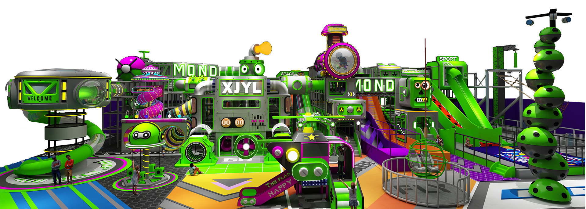
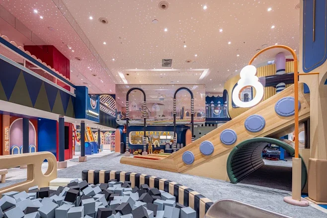
While a lot of operators are still trying to figure out where the latest indoor playground franchising trends are heading, top-tier venues have already quiet-quitted the old-school look. They’re lowkey waging a total color war.
If you’re launching a new spot or planning an indoor playground design refresh in 2026, and you’re still trying to pack your space with those blinding primary reds, yellows, and blues—hold that thought. You might want to run the numbers first. Are you seriously down to lose 35% of your foot traffic and get straight-up ghosted by high-end landlords just for the sake of “classic” playground colors?
Let’s be real. In the 2026 commercial play scene, aesthetics and operations are getting a massive glow-up. Those aggressively bright, color-blocked setups that used to dominate the market are officially giving off cheap, outdated energy. Instead, low-saturation, high-vibe palettes are taking over. This isn’t just designers being extra—it’s a calculated business move driven by dwell time, social media clout, and strict commercial real estate standards.
The Hidden Cost of Sensory Overload: How Neon Spaces Drive Families Away
For the longest time, the unwritten rule of commercial play equipment manufacturing was that kids only care about stuff that’s bright and shiny. But fresh 2026 data on play-space color psychology completely debunks that myth.
Massive walls of high-saturation colors are basically visual noise. They overstimulate a kid’s nervous system, making them anxious and hyper. Ask any venue manager: the zones with the loudest colors are always where kids start wilding out, throwing tantrums, or running into each other. It’s pure sensory fatigue.
- Dwell Times Take a Massive Hit: When a space feels chaotic, kids wear out faster, and parents get hit with major visual anxiety. Data shows that venues with high-saturation colors suffer a 35% drop in average dwell time compared to spots with muted, soothing tones.
- Secondary Spending Goes Ghost: Playground ROI is all about the waiting game. The longer families stay, the more they spend on food, drinks, merch, and membership upgrades. When eye-straining colors drive parents out the door, your café and retail corners end up sitting empty.
Winning the Aesthetic War: Parent Clout and Mall “Gatekeeping”
The real decision-makers in the family entertainment space right now are millennial and Gen Z parents. They are 100% willing to pay a premium for good design, and they completely refuse to compromise on a “basic” aesthetic.
For these parents, taking the kids out isn’t just about killing time—it’s content for their feeds. Traditional red-yellow-blue parks look straight-up cheap on camera, and no amount of filtering can fix that plastic look. On the flip side, spaces designed with an intentional, low-saturation palette are instant aesthetic goals. When parents organically post high-quality snaps to Instagram or TikTok, it acts as free, hyper-targeted word-of-mouth marketing that saves you a fortune on ad spend.
Then there’s the reality of dealing with commercial landlords. Modern high-end shopping centers, master-planned communities, and even upscale parent-child restaurant play areas are all about that minimalist, quiet-luxury vibe. A loud, chaotic primary-colored playground completely ruins the mall’s curation. That’s why mall leasing managers will straight-up veto tacky design proposals. Going with a curated, low-saturation palette is your VIP pass into premium, high-foot-traffic commercial spaces.
The 2026 Color Playbook: How to Pick Palette Profiles with High ROI
If you want your custom commercial play equipment to actually command premium ticket prices in 2026, you need to ditch the basic look and lock in one of these three high-value aesthetic profiles:
1. The Muted Morandi Macaron Palette — Pure Coziness
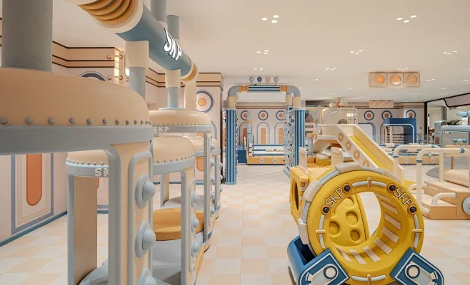
- The Look: Hazy blues, dusty pinks, mint greens, and buttercream yellows. By toning down the brightness, this palette completely eliminates visual aggression.
- Best For: Small-to-medium boutique play spaces and indoor soft play structures. In Ledi’s real-world projects, this is the absolute go-to for boutique cafe play area customization. It gives the entire space a safe, premium, and totally relaxing vibe.
2. The Earthy Neutral Palette — Raw Adventure
- The Look: Natural wood tones, oat beige, olive greens, and sandy grays. It mimics the outdoors without looking like a cheesy stage prop.
- Best For: Non-powered climbing parks, jungle adventure concepts, and high-end daycare centers. It blurs the line between indoor and outdoor play, giving city kids a grounded, adventurous environment that appeals to all age groups.
3. The Minimalist Micro-Cement Palette — Next-Gen Cool
- The Look: Off-whites and cool grays, popped with sharp black or charcoal accents. Very clean, very geometric.
- Best For: Youth trampoline parks, ninja warrior courses, and gamified sports hubs. This look strips away the “babyish” label, instantly appealing to teens, young adults, and trendy families who want something sleek and futuristic.
The Operator’s Reality Check: Debunking the Muted Color Myths
When new investors look into low-saturation designs, they usually bring up a few old-school objections. Let’s break down how things actually play out on the floor:
- Q1: Won’t off-whites and light pinks look filthy immediately and wreck our maintenance budget? Total myth. How easily indoor playground equipment stays clean comes down to the material quality, not how dark or bright the color is. All of Ledi’s custom soft play gear uses 0.55mm heavy-duty, eco-friendly PVC leather packed with a proprietary anti-fouling coating. Dust and scuffs wipe right off with a basic mild cleaner. Ironically, old-school primary-colored gear shows heavy friction marks and scratches way worse because the bright background makes dark scuffs pop, making the whole place look run-down fast.
- Q2: If the colors are too chill, will kids find it boring? Does it lose the “fun” factor? “Kid-friendly” does not mean turning the brightness up to one hundred. Overly aggressive colors actually stunt a child’s visual tracking development. The 2026 design meta is all about “low-saturation bases with intentional pops of character.” You use soothing backdrops to keep the vibes chill, then bring the fun through custom IP shapes, cool lighting, and interactive elements. Kids stay focused longer and throw fewer tantrums.
- Q3: Our legacy park looks super dated, but a total teardown is out of budget. Can we pivot on a budget? You absolutely do not need to gut the place. If your original steel framework is solid, you can pull off a massive glow-up just by swapping out the soft padding skins, ball pit colors, slide surfaces, and netting trims. Swapping out bright vinyl for timber accents, grays, and creams can completely neutralize the old eyesore. Ledi’s design team specializes in this—we provide free 3D playground remodeling blueprints based on your current footprint, helping you flip a dated space into an Instagram magnet without breaking the bank.
The 2026 indoor playground market has officially outgrown the “louder is better” era. Moving away from cookie-cutter primary colors and embracing low-saturation palettes isn’t just a design trend—it’s how you capture modern consumer spending, slash your maintenance costs, and maximize your revenue per square foot.
As a direct factory specializing in custom play equipment and experiential space planning, Ledi handles everything from free 2D/3D conceptual layouts to full turnkey manufacturing and on-site installation. Stop settling for the same look as everyone else. Let’s build a high-aesthetic, high-yield venue that keeps your competition irrelevant.